Vintage Vegas, Reimagined
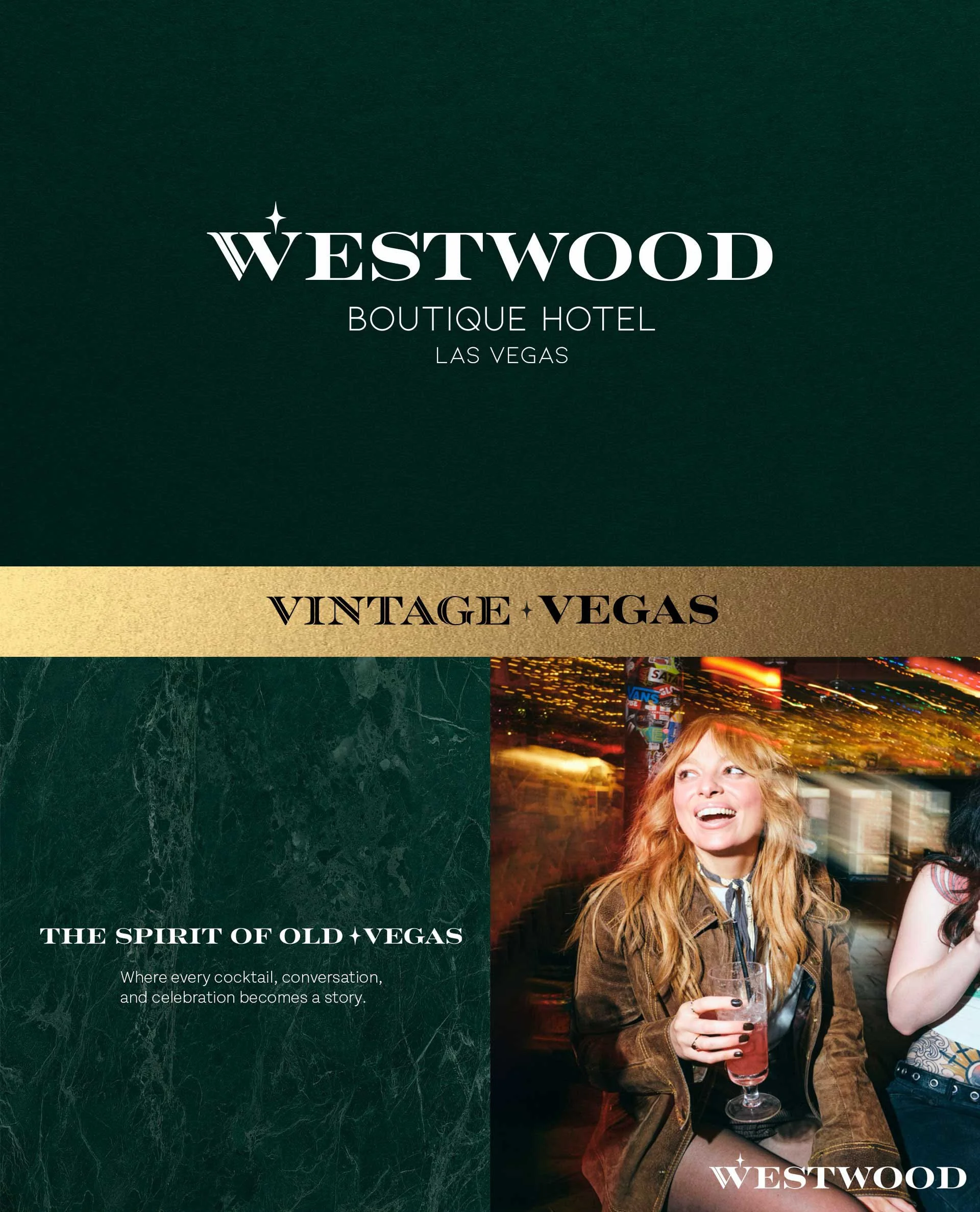
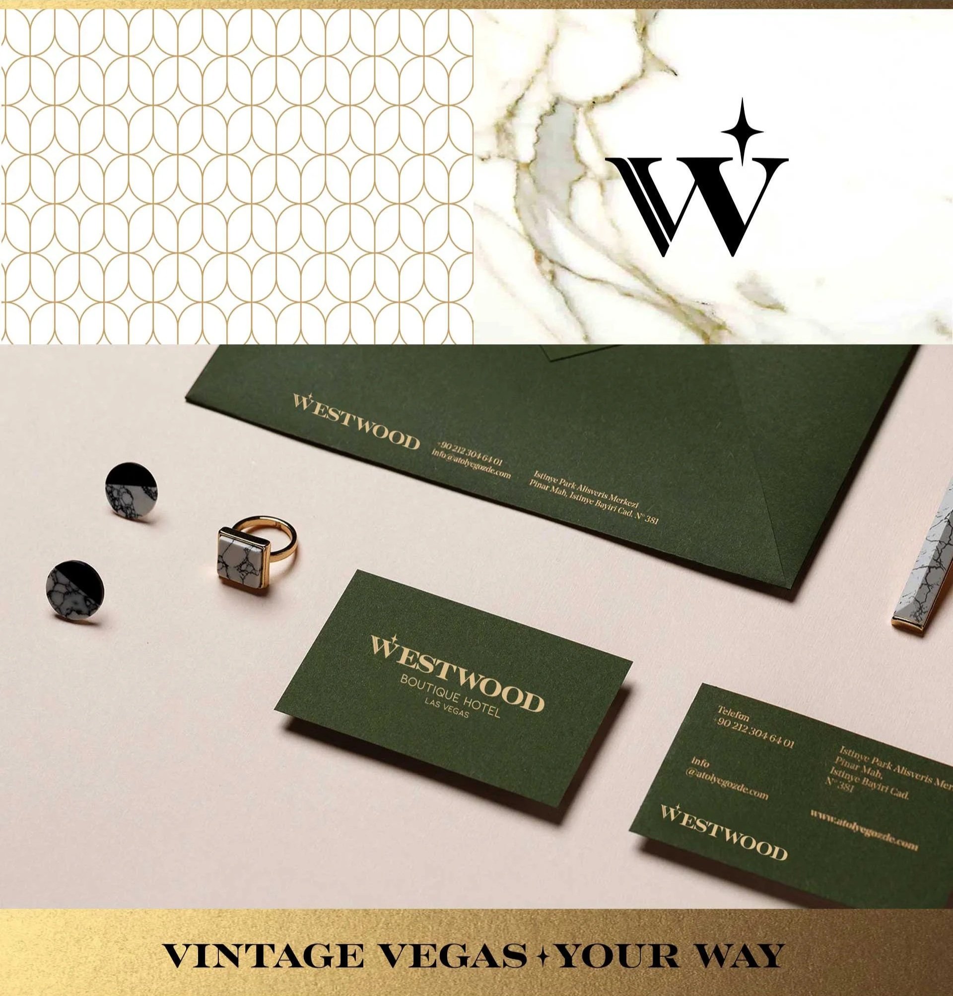
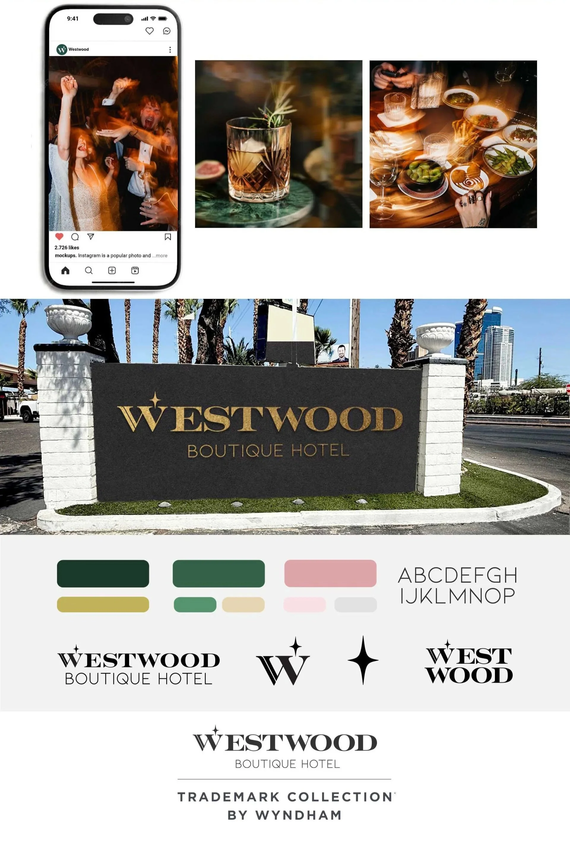
Celebrating an era when Las Vegas embraced warm hospitality and endless possibilities. Rather than recreating the past, the brand reinterprets it through a modern lens, capturing the character, craftsmanship, and sense of discovery that made Vintage Vegas unforgettable. Our wordmark hides a quiet detail: the two V's of "Vintage Vegas" converge to form the W in Westwood, two ideas becoming one letter. Above it sits a four-pointed star, a nod to the city's mid-century architectural history, when starburst motifs marked buildings and signage across the valley as symbols of optimism and forward motion.
Look closer, and that same star reappears in the negative space of our signature pattern. Architectural and tactile, it's a subtle thread woven throughout the brand, unmistakably Westwood. The design language is mid-century in spirit: clean lines, warm tones, and character over ornament. Photography is shot like a weekend, not a brochure, with motion blur and candid moments capturing a sense of energy and movement. Vintage in feeling. Current in spirit.