Concept 1 of 3
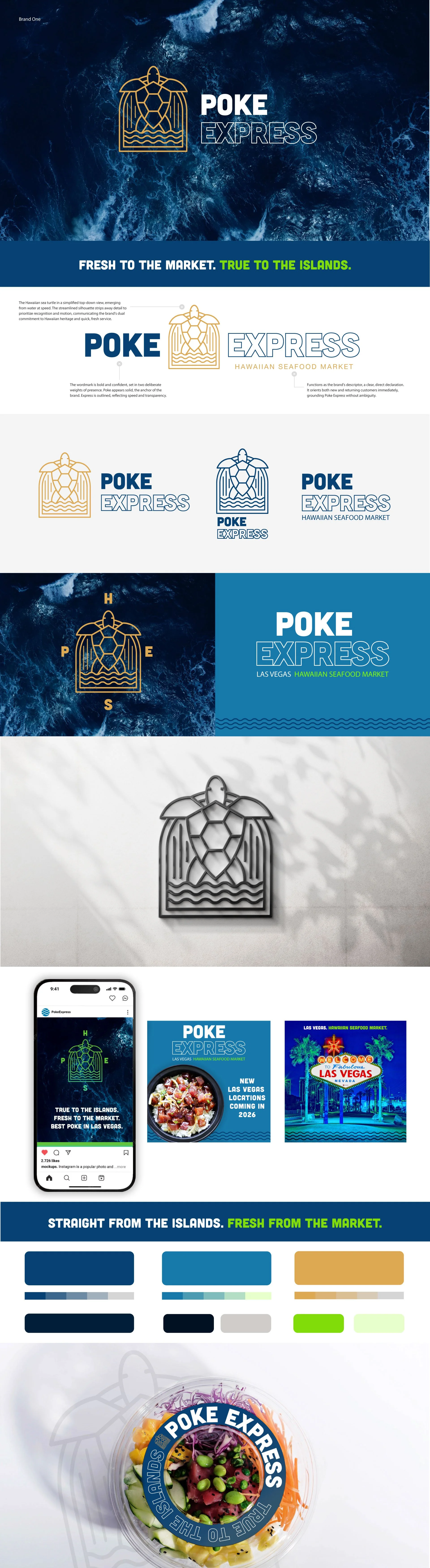
Island Provenance
At the center, a honu emerges from the water, refined into bold line art framed within an arch that reinforces the brand's connection to freshness and its Hawaiian-inspired origins. Wave forms at the base ground the mark in the ocean while vertical lines represent speed.
The warm gold icon paired with deep navy in the wordmark creates a palette that feels premium, approachable, and distinctly coastal. Clean line work and minimal detailing allow the mark to perform seamlessly across digital, print, and environmental applications.
Authentic to the islands. Refined in its presence. Ohana at its core.