Poke Express
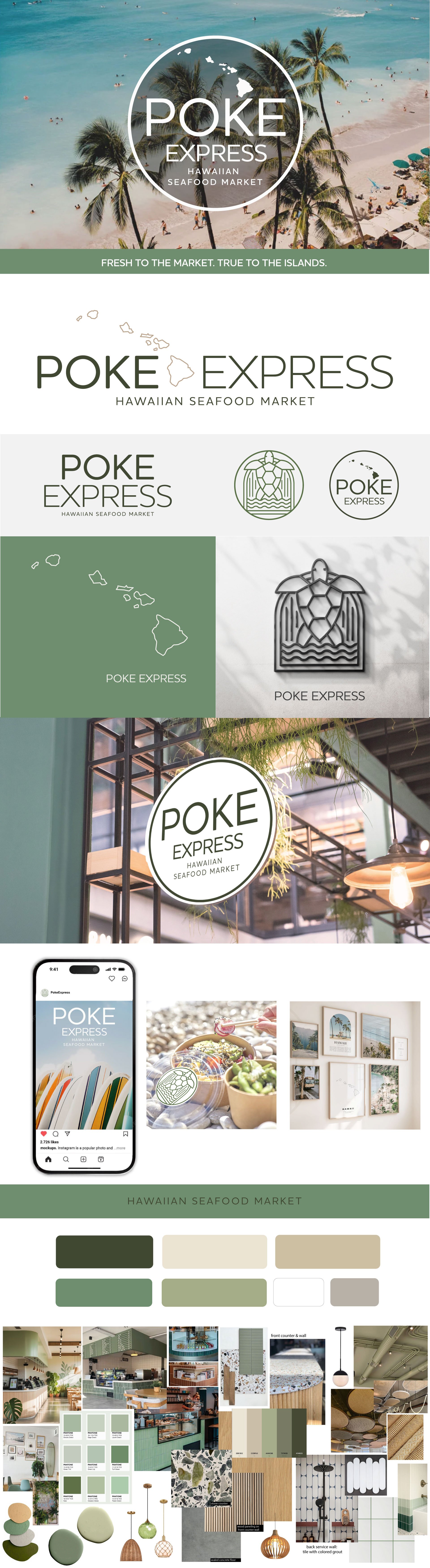
A light, washed palette of soft greens and warm sand tones gives the brand room to breathe, allowing the story of Hawaiʻi to come through naturally. The identity is centered around a refined wordmark, with select logo variations paired with the Hawaiian Islands to create an immediate sense of place and reinforce the brand's island roots.
The custom POKE typography is naturally rounded and softened, inspired by beach pebbles shaped over time by moving water. Its smooth forms create a visual language that feels organic, calm, and connected to the rhythm of the islands.
The honu has evolved from the primary logo into a standalone brand asset—an iconic illustration that can live beyond the identity system. Used across stickers, apparel, labels, murals, packaging, and supporting graphics, it becomes a recognizable symbol that the brand can grow into over time while building its own story and equity.
The wordmark remains clean, refined, and unhurried, with flexible logo configurations that pair seamlessly with the Hawaiian Islands when a stronger sense of origin is desired. This approach creates a scalable identity system that works effortlessly across packaging, signage, digital, and environmental applications.
Soft photography of the ocean, coastline, local ingredients, and island lifestyle grounds the visual world in the spirit and experience of Hawaiʻi. The palette draws from sage, sea greens, and warm sand tones to create a brand presence that feels fresh, approachable, and authentically rooted in the natural beauty of the islands.
Fresh to the market. True to the islands. ʻOhana at its core.